Contrast is where two or more elements with opposite characteristics are placed together. It is not as simple as black versus white or solid shapes versus fine lines or even the combining of organic and geometric shapes.
Using any of the elements of design a skilled designer can create a dynamic composition through the use of contrast.
All about the feels
Contrast is one of my favorite design principles because the visual impact it can make on the viewer is striking. If you are a regular reader of my column, you have probably heard me talk about ‘FEELOSOPHY’™, which is a word I coined to express the evocative power of good design and its impact on a space’s occupants. My opinion is that good design must make one feel enjoyment (joie de’ vivre.) It is a way or methodology of approaching my design work with my clients.
So, with that said, let’s dig deeper into what contrast is and can be:
• Light versus dark
• Bright versus dull
• Big versus small
• Ornate versus plain
• Organic versus geometric
• Feminine versus masculine (one of my favorites)
Think about the contrast in terms of creating tension between opposites. Again, the composition a designer creates can generate a breathtaking focal point as well as a thoughtful and interesting point of convergence.
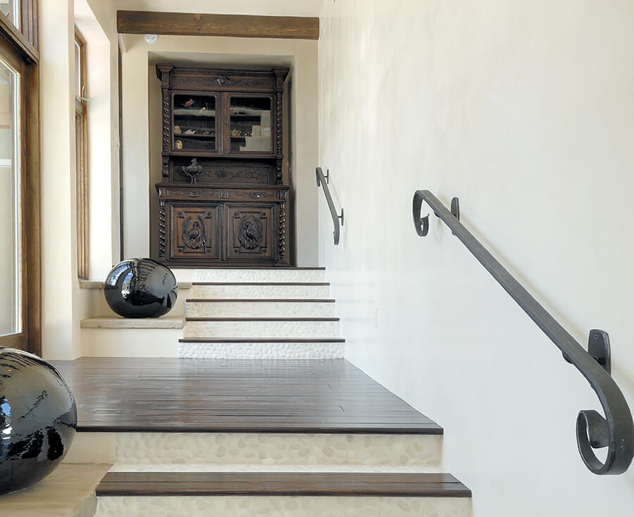
A study in contrasts
This is one of my favorite examples of creating a dynamic visual for some clients who carried an incredibly large piece of furniture ornately carved and beautifully crafted from McLean, Virginia, where they formerly lived. The style is and has been much more traditional, and many colonial antiques still live vibrantly in that area of the country. This piece was very special to my clients as Dan carefully disassembled the entire piece and restored it to its original beauty. While Dan and Robbyne wanted a contemporary-style home he was not going to part with this amazing piece of furniture. We (clients, architect, and me) decided where this beauty could live in the house. A special place was dedicated for this piece, and the architect artfully planned around it.
The task was to create a sense that this antiquity fits perfectly in a modern home. The location in the home was key because it would be in a location that would be captivating and enjoyed every day by both Dan and Robbyne.
The walls are a beautifully crafted off-white custom-colored diamond finish plaster which is a constant throughout the home. Working with the plaster color and sheen, I chose white pebbles to the riser on the stair steps which add texture and soft visual interest to the composition. The dark wood contrasts the white and marries nicely with the dark piece of furniture at the top of the hall, while the hand-wrought iron work lends an artisanal feel that echoes the carving on the furniture. The final expression of contrast was the large, glossy, black spheres which are the perfect and final touch to this design. While there are a lot of contrasting elements, this composition is balanced and harmonious and emphasizes the variety of materials.